A Successful KPI Dashboard: How to Create One

Investing time and money in a business without paying heed to performance tracking will eventually lead to a miserable state of affairs. Therefore, obtaining business metrics is integral for business growth, and it is usually represented with entities called Key Performance Indicators (KPIs).
Key Performance Indicators are usually an essence or a visual representation of business performance. They are created to help business owners understand whether their business is performing well without getting into much detail. To track the KPIs with ease, many companies have bespoke applications or monitoring tools, and a KPI Dashboard is the most common among these.
So what should you keep in mind while developing a KPI Dashboard, and what are some of the most important aspects of building the right KPI dashboard? Let’s find out!
Points To Keep In Mind
Adding Relevant KPIs Only
The audience for the KPI dashboard should be specified before you start adding KPIs to it. This will help you minimize the clutter that you add to the dashboard and improve its relevance at all times.
To take advantage of knowing the audience of the dashboard, you do not just need to identify the personnel to whom the dashboard access would be granted, but also need to know the kind of information that a particular worker would require to perform his duties for the best possible outcome.
Lastly, since the KPI dashboard is meant to aid employees in excelling in the work that they do, it would be helpful to define a strategy based on individual preferences to chalk out the ideal design for the display of information on the dashboard.
Overall, this is a task that instills some degree of customization into the system so that those who will actually use the dashboard can make the most out of it.
Structure of the Dashboard
The success of a KPI dashboard greatly depends on the data flow. A lot of interconnected systems send data outputs that need to be displayed on the dashboard eventually. Therefore, if this integration is not seamless and smooth, the functioning of the KPI dashboard will never be as per expectations.
Many experts believe that creating something like a concept map for instructing the audience about the flow of information and steps to access the relevant graphs, metrics, etc. will help users understand the data flow easily and then use the dashboard without being interrupted by a lack of technical information. An orderly structure of the dashboard will also be helpful for the users.
Try placing elements of the dashboard in a sequential manner such that developing an understanding of the performance becomes simpler as one goes through the different sections of the dashboard.
How to Build a Successful KPI Dashboard?
Once you have decided upon the KPIs that you need to measure and have had detailed discussions with all stakeholders, it is now time to create the dashboard as per the plan.
The following steps should be followed in the process of making a highly utilitarian KPI dashboard:
1. Developing A Design
Every KPI will be associated with a specific representation which is the easiest form in which it can be tracked and studied. Therefore, as you start discussing and collecting the KPIs for your dashboard, a cohesive design will start forming on its own.
Creating a prototype for the dashboard is quite understandably the first step in developing the final design. Here, you need to create a design that is most suitable for accommodating the ideal visualization of a KPI as discussed before.
When the final prototype is shared with relevant team members, even a single member not being able to grasp the data flow in the dashboard is an indication that the design needs to be tweaked further.
2. Finalizing a Dashboard Software
The number of KPI dashboard options that you have today can be overwhelming for many businesses. The process of selecting a dashboard software should be based on the requirements and the current state of business operations.
This means that factors like the price, client management, the time needed for deployment, connectivity, room for publishing dashboards via new channels, etc., should be on your mind when looking for dashboard software.
If your needs are met effectively, the good old Excel can also work wonders in developing a KPI dashboard. However, the problem with this approach is that updating and distributing data reports with Excel’s limited functionality can sometimes be a speed breaker for a company’s operations.
One thing worth noting here is that it is quite normal for your operations or your KPIs to outgrow these software solutions after a point. Thus, just like updating the KPIs, updating the dashboard software is also crucial for a useful KPI dashboard.
3. Gathering Data In Time
To gather the data that needs to be projected through the dashboard, multiple sources need to be contacted. This increases the complexity of data gathering but needs to be done very attentively so that only authentic sources are used to present the KPIs.
The importance of strategic data gathering is essential to ensure that the one who is accessing the KPI visualization does not have to dig into details to know that the representation is accurate.
All KPIs have data points that originate from multiple systems. Thus, to make your job easy, you must work on creating a spreadsheet where all information about the sources of your dashboard data is stored. This way, whenever any glitches or modifications are to be dealt with, a simple look at the spreadsheet would tell you about the system that you need to target.
Making use of APIs for data retrieval is a trend that is fast gaining popularity, primarily because it automates data influx and reduces the burden of manual entry. But still, the daunting task of building and recording the data sources has to be completed beforehand, which might take the longest time too.
4. Developing the Right Visualizations
The first look of the dashboard and the KPI representation should be pleasing but also simple enough to let users analyze data without taxing their brains. To opt for the right visualization of a KPI, the one that is the simplest to understand will be a great place to start. For instance, when a KPI presents with an option of bar charts or scattered diagrams for visualization, going with the plain bar graph would be the right thing to do.
The dashboard should come out as a tool for aiding internal communication regarding performance, for which simplicity is certainly the most viable choice. Trying to do too many things with the same dashboard can have detrimental effects.
So, try building multiple dashboards with different purposes but ensuring that each one is easy to navigate through.
5. Smooth Deployment of the Dashboard
By now, you have completed the most difficult parts of developing a KPI dashboard, but the dashboard needs to be made visible to the employees for it to do its job.
Displaying dashboards on big screens is an effective way of increasing visibility. Besides being an eye-catching way of deploying the dashboard, it also improves transparency.
Over To You
Making the right use of KPIs and developing a functional KPI Dashboard are two fundamental steps towards tracking the performance of a business. Selection and tracking of the right KPIs is an entirely different topic of discussion, but the fact that building an employee-oriented dashboard is the key to success is the biggest takeaway from this blog. More importantly, KPI dashboards need to be visible to all key stakeholders for it to be actually useful.
For that, projecting the dashboard on big office screens can be a logical idea.
EasySignage dashboard apps are widely known for providing an easy and smooth experience for displaying developed KPI dashboards on large-sized screens that can be placed in the office to help teams get constant access to the dashboards.
With EasySignage digital signage solutions, you can increase the accessibility and transparency of your KPI dashboards without worrying about compatibility issues with screens, monitors, etc.
EasySignage BI Apps
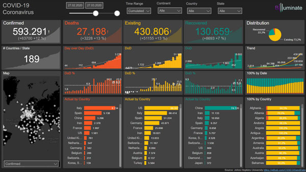
1. Power BI
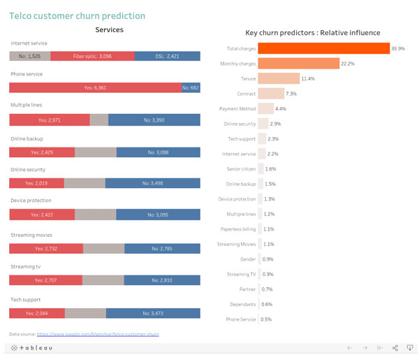
2. Tableau
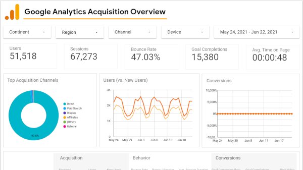
3. Data Studio / Looker Studio
Start Using Digital Signage Today
Sign up today and get (forever free) digital signage, check our website EasySignage .