How to Use Canva With EasySignage Digital Signage?
Design and art direction used to be the territory of professionals. That’s until Canva came along and made it accessible to everyone. Today, anyone can make a design in a matter of minutes on Canva.
Need a poster, signboard, presentation, or food menu? You can do it all with the free templates and images on Canva. Its intuitive layout and drag-and-drop features have made it one of the most popular platforms for anything involving design.
Why You Need Canva in Digital Signage?
A digital signage system is how you can communicate everything from breaking news to quarterly reports to healthcare protocols to your audiences. But too often, most pieces of content look the same irrespective of the sender or the viewer.
With ordinary digital signage systems, the layouts, fonts, colors, and stock photos will look the same. This robs the business of its unique brand identity. Everything it had invested in to build a distinct image is now meaningless as all brands look similar.
Canva solves that problem of uniformity and lackluster layouts. It gives managers the opportunity to develop a design language that’s unique to their business and use it in all their communication.
What makes it particularly useful for digital signages is that the site has hundreds of templates with images and fonts that you can easily customize to your business. Unlike other design applications like Photoshop or Adobe Illustrator, you don’t need any technical expertise to create a layout either.
Importantly, even the free plan has enough templates and images. You can use them for various screen sizes with the utmost ease.
Need a clean layout for your restaurant? Or a simple yet powerful design for your health club? Looking for a template with the perfect typeface for your jewelry brand? Need to design safety measures for the pandemic? Or a health infographic?
You can design all these on Canva with little effort and expertise.
Canva on EasySignage
Before you start choosing templates and images, you should define your primary objective and the target audience. Design is only effective when you know the purpose and the context.
Is it to raise brand awareness? Then you can incorporate layouts from your advertising campaign if you have one. Otherwise, you can choose a template that showcases your product or service without too many elements.
Is it a call to action for sales? Or to announce a time-bound discounted offer? Select a colorful layout that highlights the offer or discount from any of the templates.
If it’s graphs or infographics, you don’t have to spend hours adding the figures. The templates will make it easy.
Once you know your objective and your audience, you should know the design codes of your business. Do you use the same set of colors, typefaces, or any other design elements? Make sure that you incorporate those in your layouts.
If you don’t, Canva gives you the freedom to develop a style that’s unique to your brand. You can make it somber and serious or fun and dynamic. But remember that once you select a style, you’ll have to stick to it. Consistency makes it easy for people to remember.
Finally, it’s easy to get carried away as you keep discovering templates on Canva. While it’s good to experiment, remember that simplicity works well especially when you’re starting out. The fewer the elements, the greater your message-comprehension will be.
How to Use Canva in EasySignage?
Designing with Canva is easy on EasySignage. Use these simple steps to create and get your design to your digital signage.
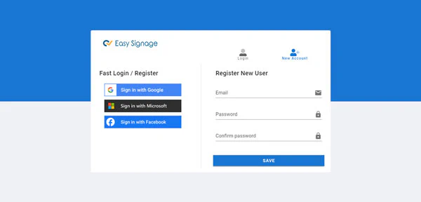
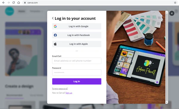
You need to set up a free account on both Canva and EasySignage to design and share between the platforms.
- Log in to EasySignage.
- Log in to your account on Canva.
- Then, on EasySignage, go to the Management Console.
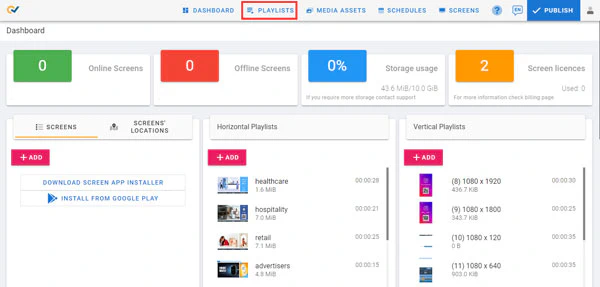
- Click on a playlist, then on a layer from the playlist.
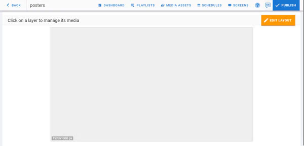
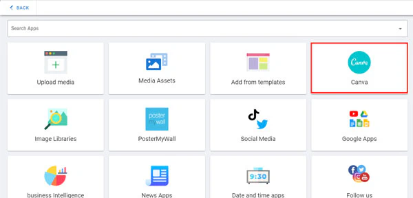
- From the options, choose Canva.
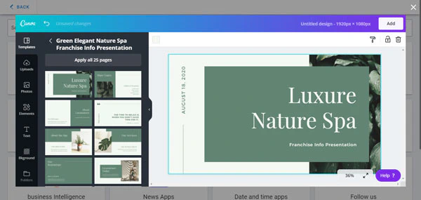
- Now it’s time to design. First, take your time to choose from the available templates. You can select several templates for your design page.
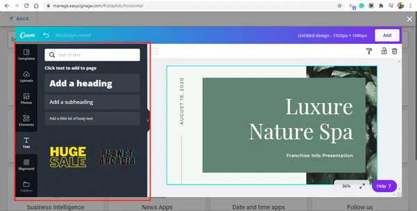
- Start designing by using the edit tools on Canva. They’re intuitive and require no design or software expertise. You can change the colors, fonts, or other design elements with just a couple of clicks. If this is your first time on Canva, choose an existing template with its image and change the text and add your logo.
- Once you’ve finished creating your design, go to the top right corner. Click on the Add button.
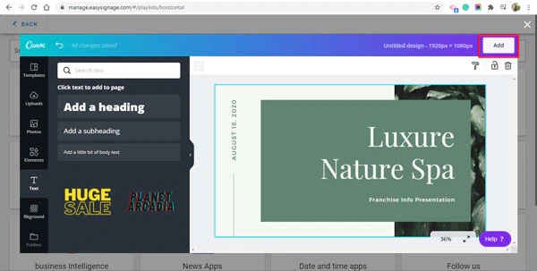
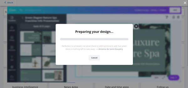
- Your design will now be imported to the playlist on your EasySignage account.
- You always have the option to make changes by clicking on Edit.
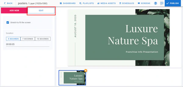
That’s it, your designs will now be displayed through the digital signage system. As you get ready to share it with your audiences, here are some best practices to remember.
Keep it simple: There’s no need to complicate things if you’re starting out. A simple template with the right text and color is all you need when you start out. Don’t compare your efforts with others who’re more experienced.
Learn from the display: Some designs will look perfect on a laptop and look different on a large display screen. The text may look out of proportion and the color may seem overpowering. These are cues for you to change it. So, it’s a good idea to see your design on the screen and look for ways to improve it.
Consistency is the key: Once you select your set of colors and fonts (both not more than two), you should be consistent in their usage. If you can add another element, like a frame or horizontal or vertical lines, make sure that you use them in all your designs. That uniformity will establish your brand identity.
With Canva, anyone can be a designer. And when it’s powered by a digital signage system like EasySignage, you have the power to create unique and compelling designs and broadcast them at scale. The process will be productive and importantly, you’ll have fun doing it.
The best part? It doesn’t take much effort to roll out a digital signage system. A trusted service provider, and the right hardware, and you are good to go.
To give your organization all the advantages of digital signage, click here for a free trial from EasySignage: manage.easysignage.com.