15 Tips for Creating Good Digital Signage Content
When it comes to digital signage, quality content is important. You might have the best screens and most advanced technology, but without well-crafted content, your digital signage will fall short and won’t deliver good results.
Digital signage is all around us, from the menu boards at coffee shops to the interactive displays in shopping malls. But how can you ensure your digital signage content looks appealing, captures attention and also delivers your message effectively?
Here are some practical tips to help you develop standout digital signage content.
15 Tips for Creating Good Digital Signage Content
Digital signage content refers to the visuals and multimedia displayed on digital screens in public and private spaces for communication, advertising, or sharing information. This content can be dynamic or static, and it’s designed to engage viewers, inform them, or promote products and services.
Types of digital signage content include text, images, videos, interactive content, social media feeds, event schedules, and more.
1. Keep It Simple and Clear - Don’t Overload Your Signage
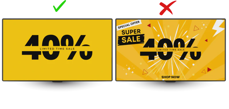
When designing digital signage content, remember that your audience often views it on the go. You only have a few seconds to make an impression. Overloading your design with too much information can confuse or overwhelm viewers.
Less is more. Stick to one key message per screen and use concise, easy-to-read text, and clear visuals to convey your message quickly. Avoid clutter by using plenty of white space, and focusing on readability.
2. Use High-Quality Visuals
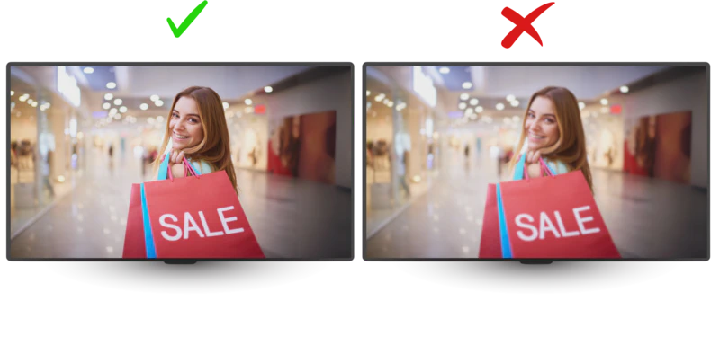
Crisp images and sharp videos make a big difference. Blurry or pixelated visuals can be a turn-off. Invest in high-resolution graphics that look professional and appealing on screen. When your content is visually appealing, it invites viewers to stay longer and absorb the information.
3. Use the 3x5 Rule
Follow the 3x5 rule, a guideline for digital signage content design that suggests you limit the amount of text on the screen using three lines of text, with no more than five words per line, or five lines of text, with a maximum of three words per line.
By keeping the text minimal, you ensure your content is easily readable, which is crucial for catching the attention of busy passersby.

4. Incorporate Bold Colour and Contrast
Bright colours and strong contrasts can make your content pop. Choose colours that align with your brand to make your content more eligible.
Also, make sure the text is easily readable against the background. For example, a dark background with light text or vice versa is a simple yet effective way to ensure clarity.
Another guideline rule you can follow when designing digital signage content is the 60-30-10 rule for colour contrast. It suggests that you divide your colour usage into three parts:
60% Dominant Colour: This is the primary colour that takes up the majority of the design, often serving as the background.
30% Secondary Colour: This colour is used to support the dominant colour without overpowering it, often in areas like text boxes, graphics, or borders.
10% Accent Colour: This is typically the brightest or boldest colour in the design. It is used to draw attention to important parts of the content, such as calls-to-action (CTAs), buttons, or key details.
This rule helps create a clean, polished, and professional design that is attractive and easy to understand.
5. Make Text Big and Readable
Digital signage content is often viewed from a distance, so make sure your text size is large enough to be read easily.
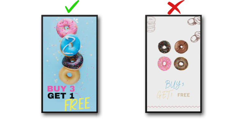
Choose bold, readable fonts that suit the overall design. Avoid using overly decorative fonts that might be difficult to read. Stick to simple Sans-Serif fonts like Arial or Helvetica for a clean and modern look.
There is also a general rule for distance viewing that helps you determine the appropriate text size based on the distance from which your audience will view, which is the 10-foot rule that suggests for every 1 inch of text height, the content should be readable from 10 feet away. Here’s how it works:
- 1 inch text height = readable from 10 feet away
- 2 inch text height = readable from 20 feet away
- 3 inch text height = readable from 30 feet away
- And so on…
An additional consideration is the viewing angle. Signage that will be viewed from extreme angles might need larger text and better contrast to remain legible.
6. Optimise for Different Screen Sizes
Not all digital signage is the same. If you’re working with large LED billboards or small menu screens, it’s important to customise your content for each screen size. What looks great on a big display might not be as effective on a smaller one.
To optimise content for different screen sizes and orientations, you can follow a general design principle known as responsive design or scalable design. Here are some key guidelines to ensure your digital signage performs well on various displays:
Aspect Ratio Consistency:
Ensure your designs keep a consistent aspect ratio that matches the screen’s resolution. For example, if the screen is in 16:9 (widescreen) or 9:16 (portrait), create your content to fit these dimensions without stretching or distortion.Scalable Vector Graphics (SVGs):
Use vector-based graphics rather than pixel-based images. Vector files can be resized without losing quality, making them ideal for digital displays of various sizes, while pixel-based images lose quality when enlarged and during edits.Resolution Independence:
Use high-resolution media that stays clear on both large and small screens. This ensures that even on a high-definition display, your images and videos will look sharp.Orientation Flexibility:
Create two versions of your content—landscape and portrait—to suit different screen orientations. For example, if your display is mounted in portrait orientation, make sure your graphics are designed in portrait mode too, for a perfect fit. Designing content specifically for each orientation ensures the best results.
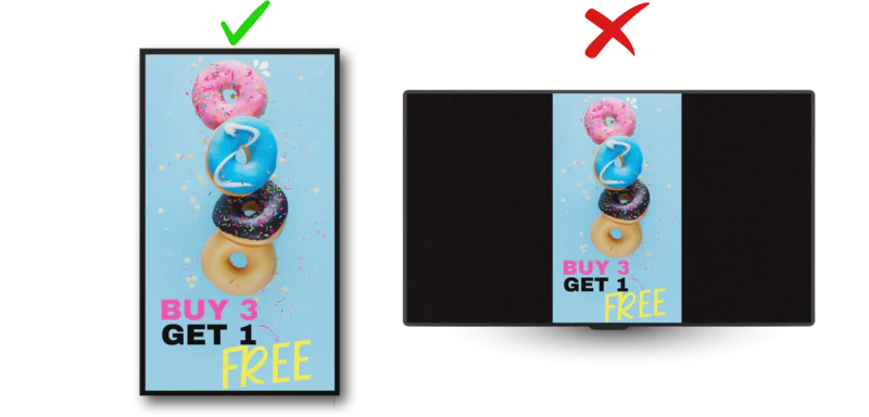
- Avoid Letterboxing:
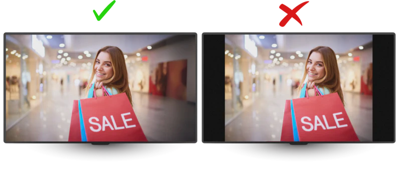
Letterboxing is adding black bars (called letterboxes) to the top and bottom, or sometimes the sides, of the screen to fill in the unused space and fit content with a different aspect ratio onto a screen without distorting the image.
Alternatively, you can create content to fit the specific screen aspect ratio or crop/stretch the content.
7. Employ Engaging Motion
Adding a touch of movement to your digital signage can greatly increase viewer engagement. Whether through animations or looping videos, dynamic content keeps viewers interested 10 times longer than static messages and helps convey your message more effectively.
Motion adds life to your content but use it wisely. Too much movement can be distracting and make your content harder to digest. Keep animations smooth and purposeful.
8. Use Section Layers on Your Display
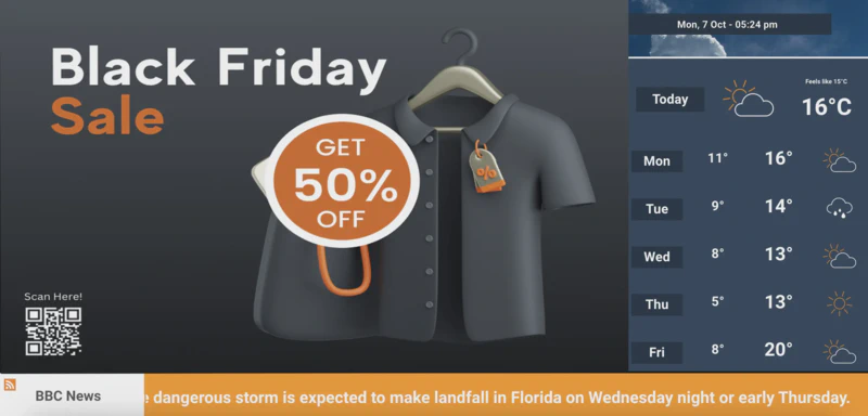
Using sectioned layers in your layout display is an effective way to organise content. By dividing the screen into different sections, you can display multiple types of content simultaneously without overwhelming the audience. For example, you might have a larger section for the main message or video and smaller sections for secondary information like news tickers, weather updates, or promotional offers.
When designing layers, consider both landscape and portrait orientations. For example, in portrait mode, layers may stack vertically, while in landscape mode, they may be arranged side by side. Ensure there is enough space and balance the information displayed in each layer to avoid overcrowding the design.
One advantage of using layers is that you can update the content in individual sections without disrupting the entire screen. This makes it easy to change information like prices, schedules, or social media feeds.
This feature is easy to implement with the EasySignage digital signage platform, allowing you to manage each layer independently.
9. Use Call-to-Actions (CTAs)
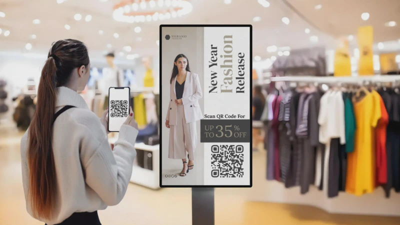
A strong call-to-action (CTA) encourages viewers to engage with your content, whether by visiting your website, scanning a QR code, or taking advantage of a special offer.
Make your CTA clear, direct, and easy to follow. Use active phrases like “Learn More,” “Shop Now,” or “Visit Us Today.” Placing the CTA in a prominent position ensures it won’t be missed.
10. Optimise for Viewing Time
Consider how long viewers will look at your signage. In high-traffic areas where people pass quickly, keep your content short and impactful. In waiting areas, you can include more detailed information.
To optimise viewing time for your digital signage, tailor your content to the average time your audience will spend looking at the screen. This ensures that your message is clear and concise.
- Audience Dwell Time:
Short Dwell Time: For viewers who will pass by quickly (e.g., busy hallways or highways), limit your content to 5-10 seconds. Use large, bold text and a single key message or image.
Longer Dwell Time: If your audience will be stationary for longer periods (e.g., waiting areas or restaurants), extend content loops to around 30-60 seconds, but avoid overly long or complex content.
- Prioritise Key Messages:
Make your most important information appear first, so it’s seen within the first few seconds, with additional content following for those with more time to watch.
11. Update Content Regularly
Fresh content keeps your audience coming back. Regular updates prevent your signage from becoming stale and show that your business is active and engaged.
With the EasySignage scheduling feature, you can plan and schedule content updates for promotions, events, or seasonal changes. This ensures your signage stays relevant and effective, while also saving time by automating updates in advance.
12. Keep Consistency:
Don’t underestimate the power of consistency in your visual presentation. Use the same colour schemes, typography, and logo placement to maintain a uniform style that builds brand recognition and reinforces your message. This will help your audience identify your content by its visual identity, enriching their connection and loyalty to your brand.
13. Highlight Important Text:
Highlight important text, such as “Get 50% Off”, to stand out on screen using visual hierarch techniques. Use bold fonts, bright contrasting colours, and larger text sizes to ensure it catches the viewer’s eye immediately.
A common rule is the 2x rule, the most important text should be at least twice the size of the body text. Additionally, place the key message in a prominent location, such as the centre or top of the screen, to help reinforce its importance.
Keep the design clean and avoid clutter to keep the offer as the focal point of the content.
14. Know Your Audience:
Understanding your audience is the first step. Are you targeting busy professionals, excited shoppers, or students on campus? Tailor your content to align with their interests and needs. The more relatable your message, the more likely it will engage them.
15. Test Before You Go Live:
Before publishing your digital signage content, test it on the actual screen. What looks great on your computer screen might not have the same impact when displayed on a large digital display.
Experiment with various content types and layouts to see what works best.
Final Thoughts
Creating effective digital signage content goes beyond just beautiful designs, it’s about making sure your message is clear, engaging, and accessible to everyone. By applying the above tips and knowing your audience, you can ensure your signage captures attention and effectively communicates your message.
With tools like EasySignage, you can easily manage and schedule your content across multiple screens and orientations, keeping your message fresh and impactful.
Well-designed digital signage will elevate the experience for your audience and drive better engagement.
So, start implementing these tips today and let your digital signage speak for itself!